How we optimize a large design system component

This article is a cross-post from Auth0's Design Medium Blog.
As our design system grows, a few components stand out like a sore thumb. They share the same characteristics: slow, massive, sometimes buggy and yet, broadly adopted. For Quantum (Auth0’s design system), it’s the Text Field component.
As one of the most robust components in our design system, the Text Field had 2205 variants. It also used Base/Master Component, which is easy to start with but can quickly get out of hand. Therefore, when Figma’s Component Property feature was released, it was clear that the Text field component could greatly benefit from this new feature.
As the person who spearheaded this project, my main goal was to reduce the number of layers and variants, remove the base component, without changing anything visual.
Result
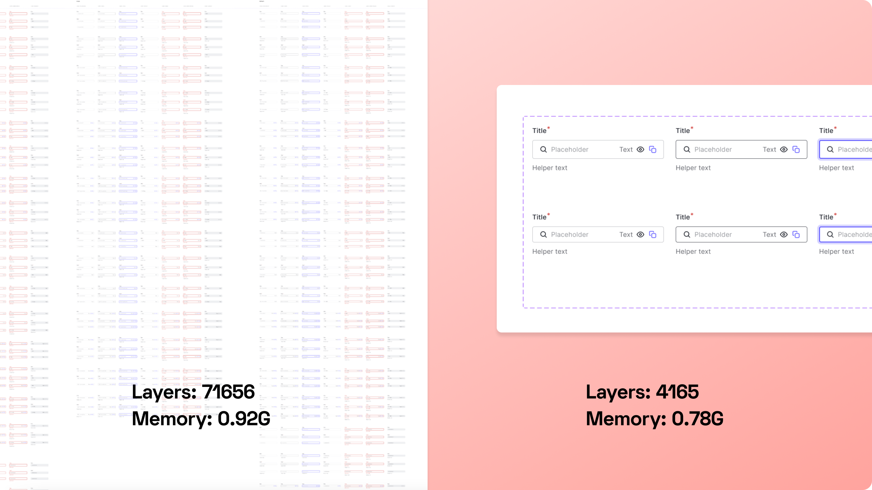
Before the optimization, the whole design system had 71,615 layers. After optimization, the number dropped to 4165. I also reduced 2205 variants to 24 variants. It was a significant change, and I noticed a nice boost in performance when loading the file too.
How did we have so many variants for a single component?
Before Figma’s Component Properties were released, our strategy was to create every possible variant, so it’s easy for designers to choose between them and see what’s available. This helped the quick adoption of our design system, but led to several bulky components.
We could have instructed designers how to toggle elements in hidden layers, but that isn’t as convenient and straightforward as laying every possibility under the sun. It’s a trade off that we deem acceptable at the time.
The process
It was a daunting task to even think about optimizing such a component. After a few grunts, sighs, and a bunch of coffee, I started refactoring the Text Field component. Since the previous strategy was using a base component with hidden layers, all instances shared the same structure. I created a brand-new instance where all layers were turned on, and then detached it to make a brand-new component in a new branch.
At first, I took full advantage of component properties. I loved how the Boolean Property surfaces (almost) all the component properties’ visibility to the design panel. I loved how easy it is for end users to swap icons and replace text, without opening layers upon layers. However, I quickly realized two problems:
The number of properties in the design panel quickly got out of hand. It was hard to find a property, even with some sly naming. It was a toggle switch hell.
By relinquishing all the controls to users, our design system now has a usability issue: it became unclear when to use some controls, and when not to use others. This can easily introduce inconsistency, and makes our design system hard to use.
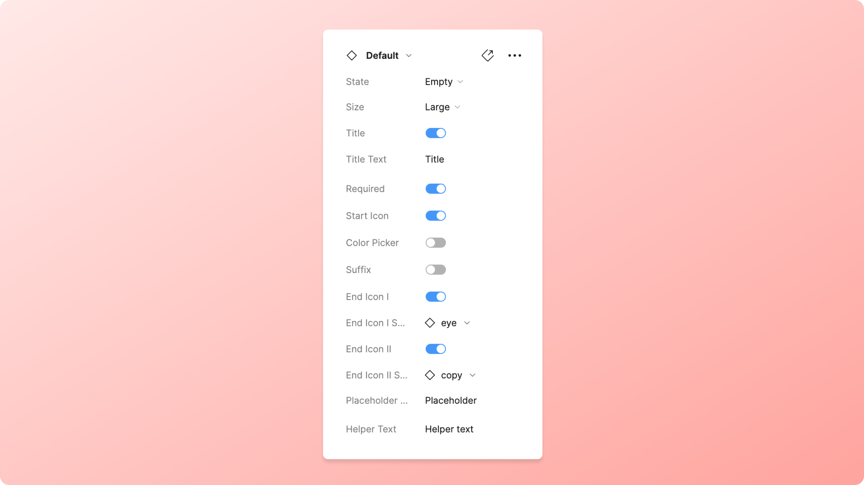
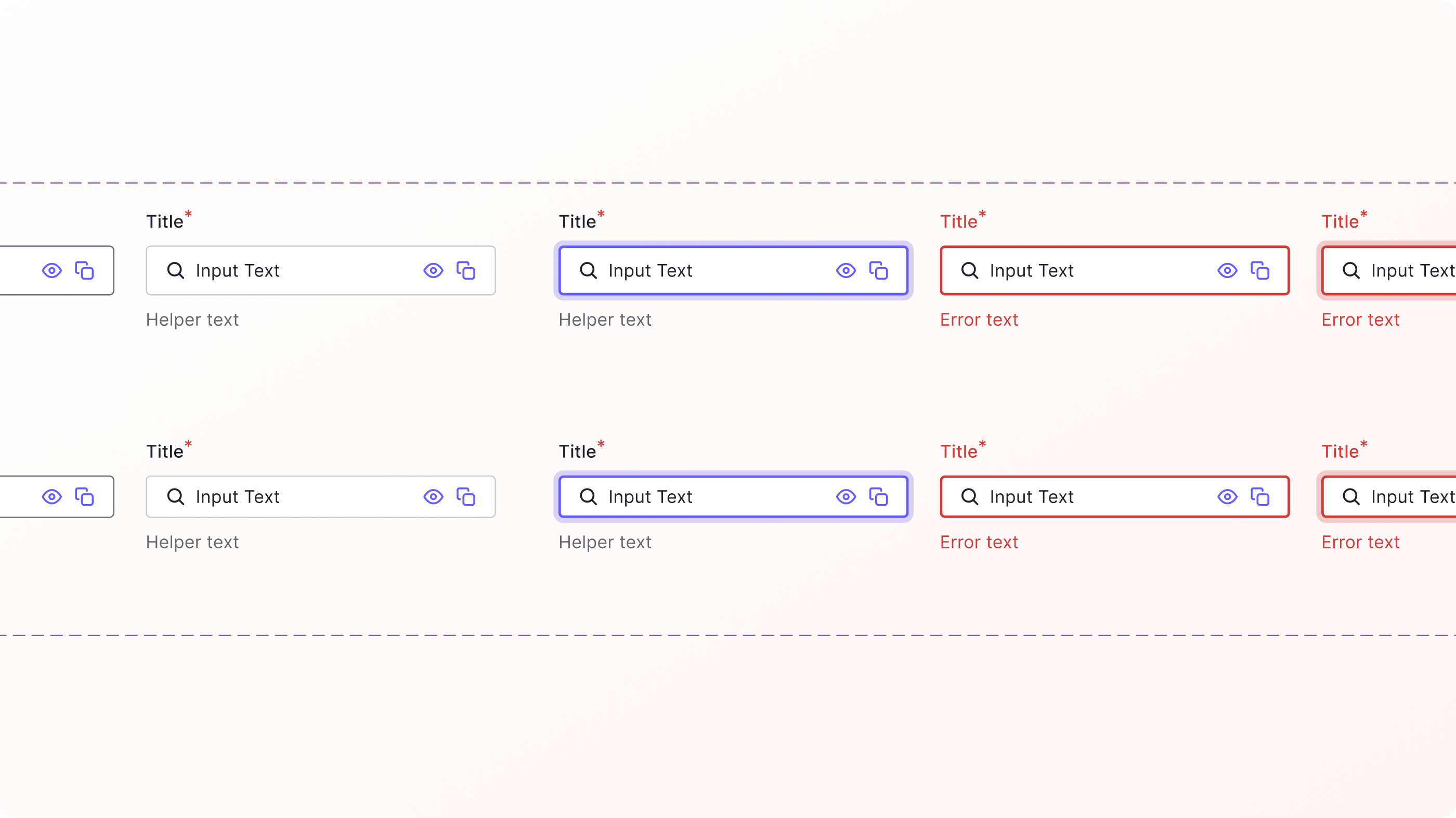
The team and I came up with a hybrid solution. We combined the usages of both component properties and variants. Shared properties like title, require asterisk, start & end icons were exposed as component properties; whereas layers like Error Text and Helper Text are nested in certain variants.
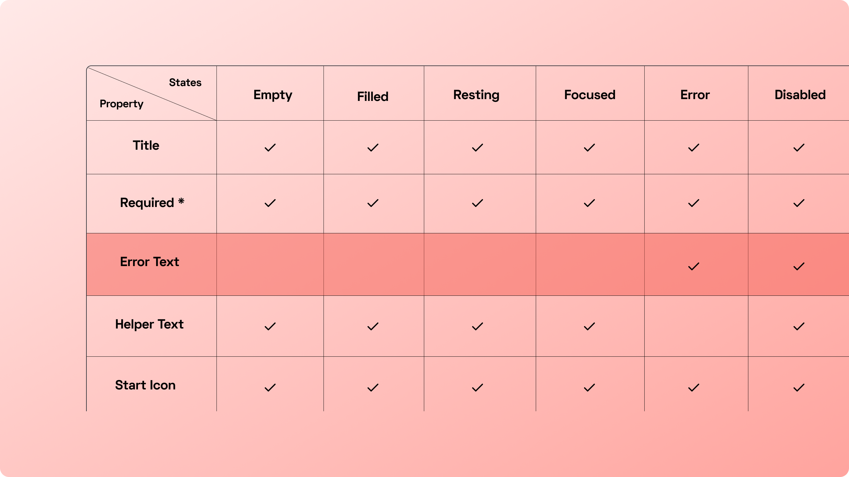
For example, since the error state variant is the only one that uses the error text layer, we didn’t expose it as a component property. Instead, the error text layer was nested in the canvas and users would have to drill in manually. This middle ground approach allows designers and developers to know what a component can do and can’t do, and also provides guidance about how they should use a component, with only a minor sacrifice in productivity.
Following this plan, I ended up with 12 component properties and 24 different variants for the Text Field component. The number of properties in the design panel was a lot more manageable: properties are scannable and findable again.
Why not Base Component?
One great thing about the previous way of using Base Component was that every possible option was available to see right on the canvas. The pain point, however, was that the sheer number of options makes the component hard to maintain. Adding a design element (e.g., an icon) to a component that has ~2000 variants was not only error-prone but also discouraging to design system contributors.
What I learned so far
A tool always comes with some caveats
Now that Figma opened everyone’s eyes with component properties, I wanted more: not only a better way to organize properties for findability, or to resize the design panel, but also how we could use it on a large, complex component without generating a sea of properties.
Short labels
Since the design panel is not yet resizable, it’s better to use short and succinct labels for each property. I omitted all default verbs like “show, swap, toggle” to avoid a full panel of labels like “Show star….”.
Figma Branch
Using Figma branches allowed me to have a peace of mind that the production file stays untouched throughout the optimization process. It also allowed our design system working group to test and discuss ideas without messing anything up.
What’s next
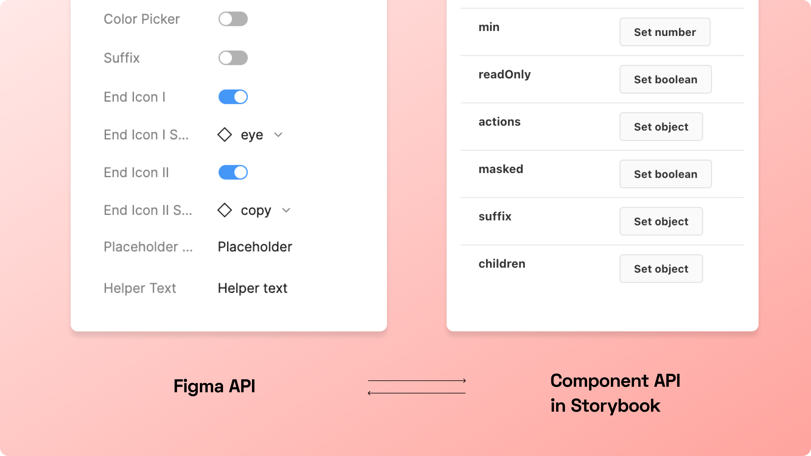
This is only a part of the story. We’re also planning to align the components API with our code counterpart’s API. What we expose in the property panel should be in sync with the code’s API. Also, our design system working group has an ongoing initiative to optimize these large components.
Resources
If you’re curious to learn more about design systems in general, check out these resources below.
And if you want to learn more about Auth0’s design system and its contributors, please don’t hesitate to reach out or comment below!